Innovative Thinking
BoxPark Sushi was a newly established business that prided itself on being the most authentic sushi restaurant in Eastside Milwaukee. Their fast-food style service was a key benefit they felt could separate them from their competitors and positioned them as innovators of Japanese cuisine. The problem they faced was wondering if their brand assets were effective in communicating their features and values clear enough to bring in customers, compared to their competition. The idea behind branding is to ensure sales and success for a product or service by making it easily identifiable to the consuming public (Brenner, 2016). To measure design effectiveness, the look and feel of BoxPark Sushi's brand needed to be tested with real people to get honest documented feedback and present the data results in an innovative graphic for BoxPark Sushi's internal and external promotion.
COMPETITION LOGOS
The first step was researching logos of sushi restaurants in Milwaukee and collecting photos and screenshots of each design elements like colors, fonts, and imagery. Their website was also examined for the ambiance of their environment, their services, and benefits to compare with BoxPark Sushi. This logo research was critical to good brand positioning (Brackett, 2017), and to make sure that BoxPark Sushi's brand was distinct and communicated a message that would outshine their competitors and attract new customers.


The Logo research uncovered that sketching was a productive way to put initial design ideas on paper. It was generally the first step professional designers took before starting a project. Why? Because according to Ray (2019), “You could quickly express what was there in your mind without making many experiments” (para. 3). Another benefit was not worry about what was a good idea and what wasn’t.

LOGO concept SKETCHES
The concept sketches did not have to be perfect which made the process comfortable. According to Ray’s (2019) suggestion, “there is no pressure of being perfect in sketching. This gives you the freedom of thought and the process of creating a logo design becomes much smoother” (para. 4). The ideas moved from thoughts through the pencil and were led by the samples collected in the logo research. The logo design had to communicate the voice and tone of the brand clearly (professional, friendly, authentic, honest) without any extra fluff. According to Airey (2014), “The simplest solution was often the most effective. Why? Because a simple logo helped meet most of the other requirements of iconic design” (p. 1). Furthermore, a simple logo would be easy to remember and easy to reproduce on other media. BoxPark Sushi’s logo had to be relevant for its products and services as well as the target audience they catered to.
LOGO REFINEMENT
The 3 refined logos were unique in that they did not include the traditional chopsticks or sushi roll. For BoxPark Sushi to stand out from the competition, their logo had to be distinct. Airey (2014) states that a logo must have a unique quality or style that accurately portrays the client’s business perspective. BoxPark Sushi wanted their clients and potential customers to see them as exciting and authentic. This perspective would help eliminate 2 of the concepts - # 3 because the fish image fits within the common icons used by many sushi restaurants. BoxPark Sushi would become just one of the crowd, lost in the shuffle, and that would weaken their brand. #11 was eliminated because the image of the chef's head lacked personality and the fonts were not consistently legible (the letter "B"). Using the right font can emphasize the advantages of the logo and brand, while an inappropriate font can evoke nasty associations and undermine trust (Leiba, 2020). This rationale led me to select #14. The overall visual was completely
different from the sushi competitor's logo, the typeface was legible and conveyed the Japanese culture, and the chef icon communicated excitement, a welcoming gesture, a reflection of the restaurant's staff, and the environment. This solution had a unique shape and distinctive marks that were memorable and could also work as a secondary image for visual campaigns across different media. It was appropriate to advance to the next stage.


Boxpark Sushi's logo needed to create an emotional connection with the consumer. To achieve this, it had to have that something extra that made them attractive, memorable, and more unique than their competition. Revisions were made and color added to strengthen their overall visual and brand message.
SOLUTION REJECTED
This design solution captured the attention of my Professor and classmates. The position of the chef's arms and legs as the letter "X" triggered an emotion that conveyed excitement. The message they perceived was, "Hey! Come to our restaurant and enjoy our delicious food!" Although this message was on track with the restaurant's brand, the chef did not look authentic. At this stage, this solution would get attention but not really strong enough to outshine the competition.
SOLUTION ACCEPTED
The final design was a good representation of Airey’s principle of “distinction.” During my research on sushi logos, the majority contained images of chopsticks, fish, and sushi rolls. Using a full-body chef was innovative and separated BoxPark Sushi from its competition, plus the logo was recognizable from its outline (Airey, 2014). To remain relevant and authentic, a font called “Hong Kong Hustle” was used for the word “BoxPark” and a font called “Asian Hero” for the word “Sushi.” Using these two fonts reflected the business products and Japanese culture.
Chef hat doesn't
look authentic

Overall shape unbalanced
Chef attire not noticeable. It looks like an "X" overkill.
The word "Sushi" competes
with company name
Chef attire more authentic and recognizable.
Overall shape more balanced and structured.

The word "Sushi" fits within the overall form of the logo and doesn't compete with the restaurant name.
Utilizing the specific changes above not only strengthen BoxPark Sushi's brand but positioned it under two of Airey's principles. 1) Incorporate tradition: Japanese history and culture will last a lifetime. Using Japanese typefaces will keep the brand up to date regardless of popular trends. A logo that represents a certain tradition, especially culture, conveys longevity, and stability. 2) Make it relevant: The Japanese typefaces were appropriate for the business it identified (Airey, 2014). BoxPark Sushi was a Japanese restaurant, therefore, using a Japanese typeface made an immediate connection with consumers. The chef image accurately reflected the passion and excitement of the environment. They were eager to make the client’s dining experience fun and memorable.

Outrageous Orange
R,241 G,95 B,36
C,0 M,61 Y,85 K,5
HEX F15F24
Flaming Red
R,141 G,24 B,27
C,0 M,83 Y,81 K,45
HEX 8d181b
COLOR
To stimulate the right emotions in BoxPark Sushi's target audience, the logo and final brand needed the appropriate colors. Research uncovered valuable information about color theory that guided my decision for the logo color palette. The color orange was a combination of yellow and red that conveyed excitement, warmth, encouragement, and enthusiasm (Graf1x, 2014). It was a motivating color that appealed to young adults which connected well to BoxPark Sushi's demographic ages 30 and up. In Japan, orange denoted love and happiness and was a popular color in clothing (Olesen, 2019). Most importantly, it stimulated the appetite associated with healthy foods, which was a perfect reflection of BoxPark Sushi's cuisines (2019). Red seemed to attract the most attention which isn't a bad thing. This color was bursting with passion and signified strength, and power (Graf1x, 2014), two attributes that conveyed BoxPark Sushi's organizational structure. Red in Japan also denoted strength, passion, and self-sacrifice (Olesen, 2019), appropriate colors that reflected BoxPark Sushi's work ethics and professionalism.
The visual of the brand was colorful and straight forward. This conveyed a company that was fun but direct. Why? Because BoxPark Sushi understood that their clients had very little time to waste but they still wanted to put a smile on their faces while serving their meal. Their clients didn't have time to filter through cluttered digital effects or asymmetrical shapes. The design was organized and structured so that the message is clear and legible.


DESIGN ASSETS
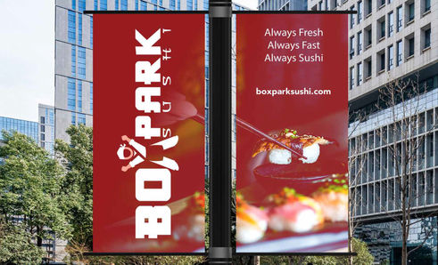
The intended message for BoxPark Sushi was they offered fresh authentic sushi fast for the consumer on the go. The visual conveyed this message in every asset of the brand (building sign, pole banner, car wrap, etc. The big question was would the consumer perceive the same qualities of the restaurant when they saw these assets or would they interpret a different message althgether.


The most efficient method to find out if the visual assets helped to solve BoxPark Sushi's unique problem was through surveys and questionnaires. Looks were an important factor, but they alone would not tell them if the design was effective” (Creger, 2019, para. 2).
SURVEY
Although there were many ways to evaluate the design effectiveness of a brand, research uncovered one simple solution - survey the target audience. Using the survey strategy would be effective in collecting quantitative information by asking participants a set of questions in a specific order” (O'Grady & O'Grady, 2017). The benefit was it would allow BoxPark Sushi to collect demographic or psychographic data from a large audience within a short period (O'Grady & O'Grady, 2017. This data could be used to confirm creative solutions or lead design decisions
The success of the survey
depended on whether good data
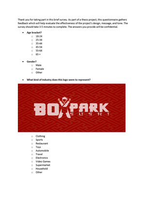
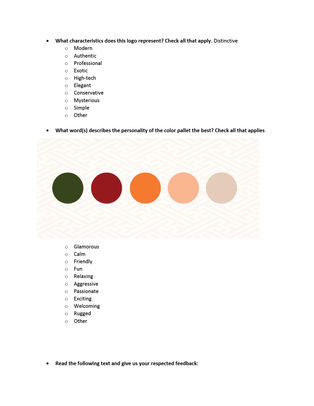
Survey and Questionnaire
was collected. The only way to get that data was to ask the appropriate questions. After exploring how to create surveys, data confirmed that the best surveys were simple, concise, and organized in a logical order. They contained a user-friendly balance of short-answer and multiple-choice questions that derived specific information from the participant (Bernazzani, 2019). With this in mind, each question was carefully formatted and dissected to make sure the answers would reflect what was needed – If the design elements communicated Boxpark Sushi's personality.
Questions were crafted about specific features and attributes of the restaurant and submitted online through social media and email.
SURVEY responses
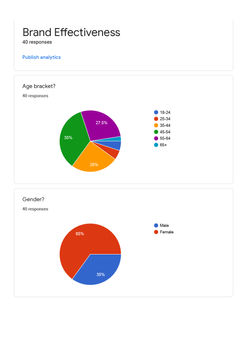
The overall perception of the brand assets was professional and distinctive with a friendly personality. Many responses to the character questions were positive and connected perfectly with the voice and tone of BoxPark Sushi (friendly, honest, professional, authentic). Data conveyed that the brand message reflected confidence in its product and services. This data was supported by a large response to BoxPark Sushi's introduction paragraph. Out of 40 responses, 28 selected the "confident" box, followed by passionate, honest, respectful, and optimistic. Important soft values were identified based on the opinions, feelings, and interpretations of the respondents (Objectivity, 2017). Clearly, BoxPark Sushi's brand message was feasible for its target audience because the respondent's opinions and perspective matched closely with Boxpark Sushi's characteristics. The respondents saw the logo as authentic, distinctive, and exciting, the color palette as friendly, passionate, and welcoming, and the assets positive and consistent. This was great data that needed to be collected, synthesized, and transformed from text into an attractive data visualization (Pittenyturf, n.d).
Survey data is commonly presented using a data visualization style called infographic, an artistic aesthetic represented with numbers, charts, graphs, or vector images used to capture attention and enhance comprehension Ritchie, 2020. Since BoxPark Sushi was a unique restaurant with a unique brand, the data had to be presented in an innovated way.
infographic research
Infographics from competing restaurants were explored and they all had one thing in common - vector art. Nothing stood out that separated one company from the next. You could switch their logos around without disturbing their visuals. Keep in mind that the goal of an infographic is not only to inform but also to make the viewing experience fun and engaging for the audience (Sheikh, n.d.). The objective of BoxPark Sushi's infographics was to be more personal, present a data visualization graphics that functioned as an art piece (Ritchie, 2020), something their target audience could relate to and grab the attention of potential customers.


According to (Pittenturf (n.d.), the biggest benefit of data visualizations is the efficiency gained through proper execution. A well designed visual will save the data analyst precious time as it can communicate the message of the data concisely and without ambiguity (para. 4). BoxPark Sushi's infographic would stand out immediately from their competition because of the realistic content.
INSPIRATION
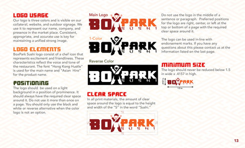
Inspiration was derived from BoxPark Sushi's brand guide. There were many ways to make this infographic visually interesting, but instead of designing with conventional vector icons, photography stood out amongst them all. The infographic elements connected directly to BoxPark Sushi's demographic and products. Photo images were used to create custom icons to add depth and enhance the overall aesthetic. (Khoja, 2020). The photography approach enhanced the overall look and feel of the infographics.
Brand Guide
Demongraphics


The results were an innovative artistic visual style that improved data comprehension, synthesis, and ultimately recall (Ritchie, 2020, para. 7). Researching and identifying the status quo in the sushi restaurant market helped develop a design solution that outshined them. The visual of the final solution stood out stronger than the status quo because the photographs carried more personality and reflected real clients. Some images were cropped down and overlaid with BoxPark Sushi's brand colors to push and strengthen their identity. The photography strategy was innovative because it was more attractive, had more character, and literally put a face to the opinions and feelings of their target audience (Khoja, 2020).
final solution

status quo


References
Airey, D. (2014). Logo design love a guide to creating iconic brand identities. Berkeley, Calif. New Riders.
Bernazzani, S. (2019, July 30). How to Write Good (Even Great!) Survey Questions, https://blog.hubspot.com/service/survey-questions
Brackett, E. (2017, February 01). Competitive Research and Brand Positioning: Your Logo Must Be Different, https://www.visiblelogic.com/blog/competitive-research-and-brand-positioning/
Brenner, L. (2016, October 26). How to Measure if Branding Is Effective, https://smallbusiness.chron.com/measure-branding-effective-10102.html
Brown, E. (2020, April 20). Tips To Make Your Logo Unique: DesignMantic: The Design Shop, https://www.designmantic.com/blog/tips-to-make-your-logo-unique/
*Creger, R. (2019, December 10). How to evaluate the quality of your design. Retrieved June 06, 2020, from https://99designs.com/blog/tips/evaluate-design-quality/
Graf1x. (2014, September 14). Color Meaning and Psychology, https://graf1x.com/color-psychology-emotion-meaning-poster/
How to write good survey questions. (2020, March 04), https://resources.pollfish.com/market-research/how-to-write-good-survey-questions/?utm_source=google
Khoja, N. (2020, March 07). How to Enhance Your Infographics With Images, https://barnimages.com/enhance-infographics-with-images/
Leiba, D. (2020, March 23). How to Choose a Font for Your Logo, https://www.logaster.com/blog/how-to-choose-font-for-logo/
O'Grady, J. V., & O'Grady, K. V. (2017). A designer's research manual: Succeed in design by knowing your clients + understanding what they really need. Beverly, MA: Rockport, an imprint of The Quarto Group
Olesen, J. (2019, August 02). Color Meanings In Japan, https://www.color-meanings.com/color-meanings-japan/
Pittenyturf, C. (n.d.). What is Data Visualization and Why is it Important? https://data-visualization.cioreview.com/cxoinsight/what-is-data-visualization-and-why-is-it-important-nid-11806-cid-163.html
Ray, H. (2019, December 14). How To Proceed With Sketching Of Logo Design, https://www.designhill.com/design-blog/how-to-proceed-with-sketching-of-logo-design/
Ritchie, J. (2020, July 01). What Is an Infographic? Find Out What They Are and Why They're Useful, https://www.columnfivemedia.com/infographic
Sheikh, M. (n.d.). What is an Infographic? (Examples, Tips and Templates), https://visme.co/blog/what-is-an-infographic/
